Understanding The Project
Overview
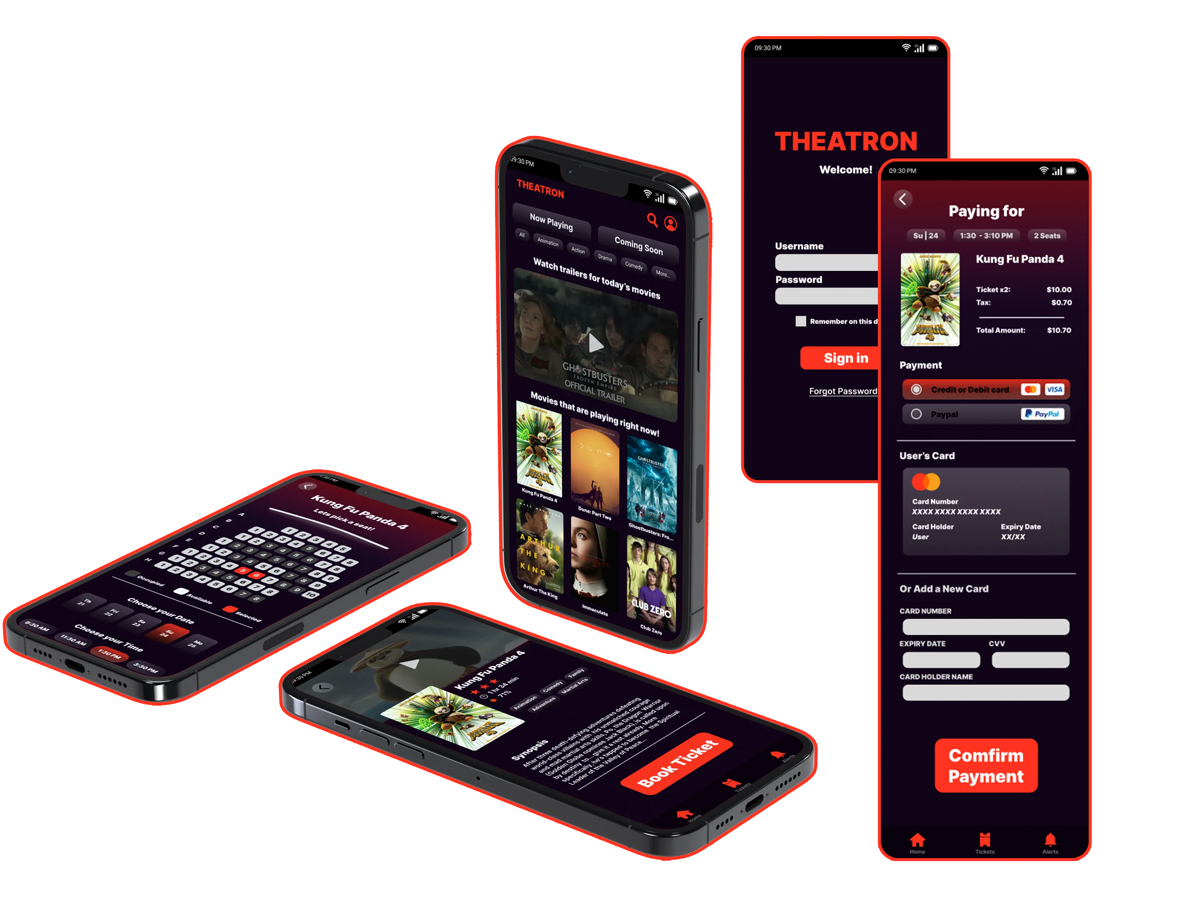
This case study details my full design process for Theatron mobile app. The project focuses on creating a user-friendly experience for a diverse audience, allowing users to easily browse movies, purchase tickets, and select seats. We will explore the phases: Empathize, Define, Ideate, Prototype, Testing, and Final Design.
Skills
My Role
Timeline
April 2024 - May 2024 (around 3-4 weeks)
Since this was a skill-building project and Theatron is a fictional theater, I designed the entire app from the ground up. I first needed to clearly understand possible real users and explore the basic ecosystem of this kind of application through competitive audits and looking at references for similar apps.
Empathize: Understanding the User
Empathy
Before diving into design, I needed to deeply understand the target audience: moviegoers. My goal was to uncover their needs, motivations, and pain points when it comes to buying tickets and attending movies. To achieve this, I employed several user research methods, like creating an empathy map and developing user personas. These tools helped me step into the shoes of my users and gain valuable insights that informed the entire design process.
User Personas
To represent the target audience, I created two distinct user personas: Sarah, a tech-savvy marketing manager, and David, a busy parent. These personas helped me focus on the specific needs and frustrations of different user groups.
Sarah
Age: 28
Occupation: Marketing Manager
Tech Proficiency: High
Movie Habits: Frequent moviegoer (3-5 times/month), enjoys various genres, prefers watching with friends.
Goals: Quickly find showtimes, easily purchase tickets, avoid lines, select specific seats, discover new movies.
Frustrations: Long lines at the box office, difficulty finding good seats, confusing or outdated theater websites.
Quote: ""I love catching a movie with friends, but the ticketing process can be a real hassle. I want something quick and easy."
David
Age: 42
Occupation: Software Engineer
Tech Proficiency: Medium
Movie Habits: Occasional moviegoer (1-2 times/month), primarily attends family-friendly movies with his wife and two children.
Goals: Easily find age-appropriate movies, purchase multiple tickets at once, choose seats together, have a smooth, stress-free experience with his family.
Frustrations: Limited selection of children's movies, difficulty finding seats together, complicated online ticketing processes.
Quote: ""Going to the movies with the kids can be chaotic. I need an app that makes it easy to plan and purchase tickets for everyone."
User Stories
To clearly define user needs, I framed them as user stories, focusing on the "who," "what," and "why" of each interaction with the app.
Empathy Map
The empathy map served as a powerful tool to synthesize my research and visualize the user's experience. It helped me understand not only *what* users do and say but also *how* they think and feel. This perspective was crucial for developing a truly user-centered design.
Says
“I love the immersive experience of watching movies on the big screen.”
“Waiting in long lines at the theater is a major mood killer.”
“I like to check reviews and ratings before buying a ticket.”
Thinks
“It's frustrating when I can't get the seats I want, especially for popular movies.”
“I wish buying tickets and concessions was quicker and more convenient.”
“Having everything on my phone would make the whole process so much smoother.”
Does
Watches movies regularly, both at the theater and at home.
Uses mobile apps for various purchases, including food delivery, ride-sharing, and online shopping.
Actively reads movie reviews and engages in online discussions about films.
Feels
Excited and enthusiastic about new movie releases and cinematic experiences.
Frustrated and annoyed by long lines, complicated processes, and limited seat availability.
Appreciates convenience, good value, and a seamless, hassle-free movie-going experience.
Define
The Define phase involved synthesizing the research insights to clearly articulate the core problems and user needs. This included crafting a concise problem statement, a testable hypothesis statement, and a compelling value proposition to guide the design process.
Problem Statement
Moviegoers, regardless of their age or tech-savviness, often experience frustration with outdated and inconvenient ticketing methods. They desire a more streamlined, efficient, and enjoyable way to browse movies, purchase tickets, and manage their entire movie-going experience, including seat selection and concessions.
Hypothesis Statement
A user-friendly mobile app can significantly improve the movie-going experience. By offering seamless browsing, simplified ticket purchasing, intuitive seat selection, and convenient concession pre-ordering, Theatron will address user pain points and increase satisfaction. This hypothesis is based on the assumption that users value convenience, speed, and control over their movie-going experience.
Value Proposition
Theatron provides a hassle-free and enjoyable movie ticketing experience. It eliminates the need for physical tickets and long lines, offering a streamlined process accessible at any time, right from your mobile device. Users can browse movies, select seats, and make secure purchases with ease, allowing them to focus on the excitement of the movie itself.
Competitive Audit
To understand the competitive landscape, I conducted a competitive audit of existing movie ticketing apps and websites. This analysis helped me identify opportunities to differentiate Theatron and provide a unique value proposition.
Fandango
Product Offering: Movie listings, ticketing, trailers, reviews, celebrity news.
Strengths: Comprehensive movie information, integration with Rotten Tomatoes, large user base.
Weaknesses: Can feel cluttered, complex interface, less focus on the local cinema experience.
Atom Tickets
Product Offering: Ticketing, group bookings, concessions, social features.
Strengths: Group discounts, social planning tools, focus on shared experiences.
Weaknesses: Limited theater coverage, emphasis on group bookings may not cater to individual moviegoers.
AMC Theatres
Product Offering: Ticketing, loyalty program (AMC Stubs), seat selection, concessions.
Strengths: Loyalty program benefits, wide theater coverage, integrated experience.
Weaknesses: Primarily caters to AMC theaters, less flexible for users who frequent other cinemas.
Theatron's Competitive Advantage
Based on the competitive audit, Theatron's competitive advantage will be:
Elegant Simplicity
A clean and intuitive interface that focuses on core functionalities, providing a streamlined and user-friendly experience for all users, especially those less familiar with technology.
Independent Charm
Embracing and showcasing the unique character of "Theatron" as an independent theater, providing a distinct brand identity and experience that sets it apart from larger cinema chains.
Ideate
The Ideate phase focused on translating research insights and project goals into tangible design solutions. This encompassed information architecture, user flows, and initial sketches to shape the website’s structure and user experience.
Information Architecture
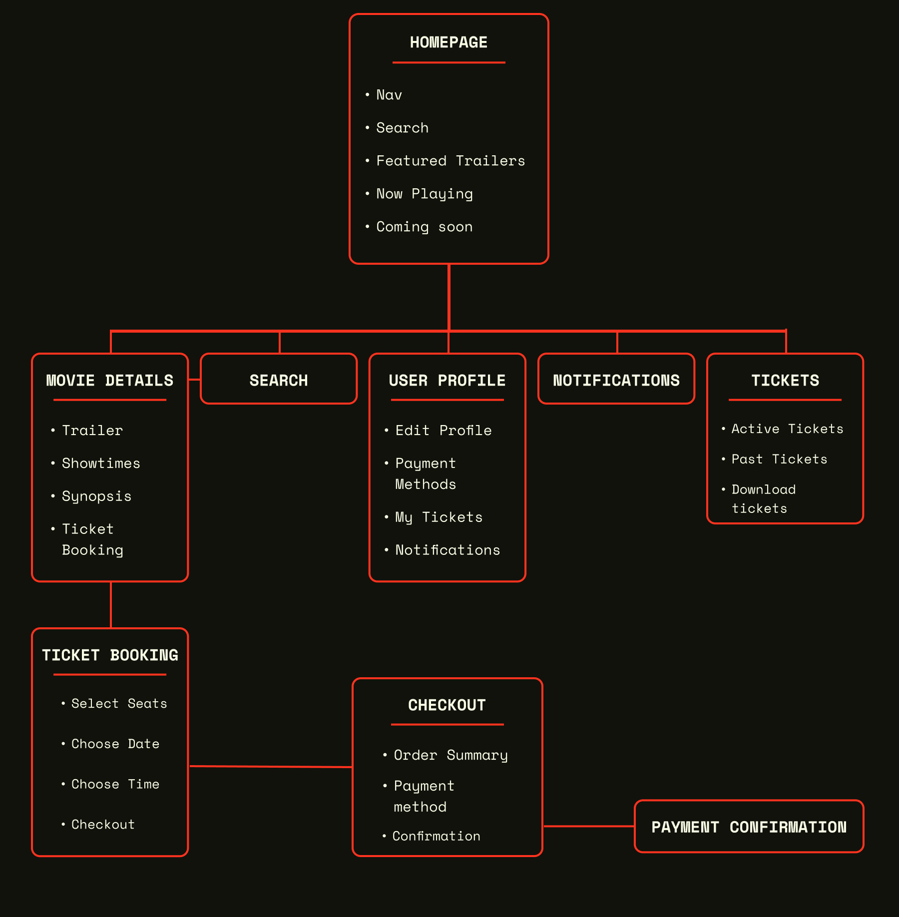
A well-defined information architecture is crucial for ensuring intuitive navigation and a seamless user experience. I created a sitemap to visualize the app's structure and hierarchy, organizing content in a logical and user-friendly way.
User Flows
I developed a User Flow to visualize the steps and stop any possible issues in the process that the users would take in order to buy tickets for a specific movie. In this case, smooth edges mean an action taken by the user, straight edges mean an app screen, and the diamond shape means a decision.
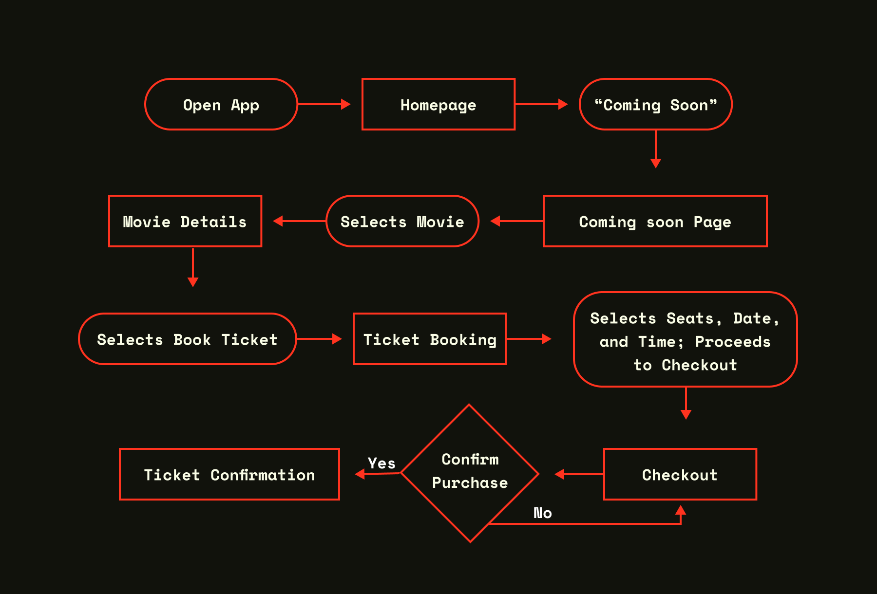
User opens Theatron. The homepage displays currently playing movies with posters showing each one. The user navigates to the "Coming Soon" section, from there they select a specific movie. The Movie Details screen now displays a trailer, synopsis, and general information. The user then books a ticket; the ticket booking screen shows a seat map with available seats, dates, and times. The user chooses according to their comfort, goes to checkout, uses various payment methods, confirms the payment, and gets their digital ticket ready to use at the theater.
Sketches and Early Ideation
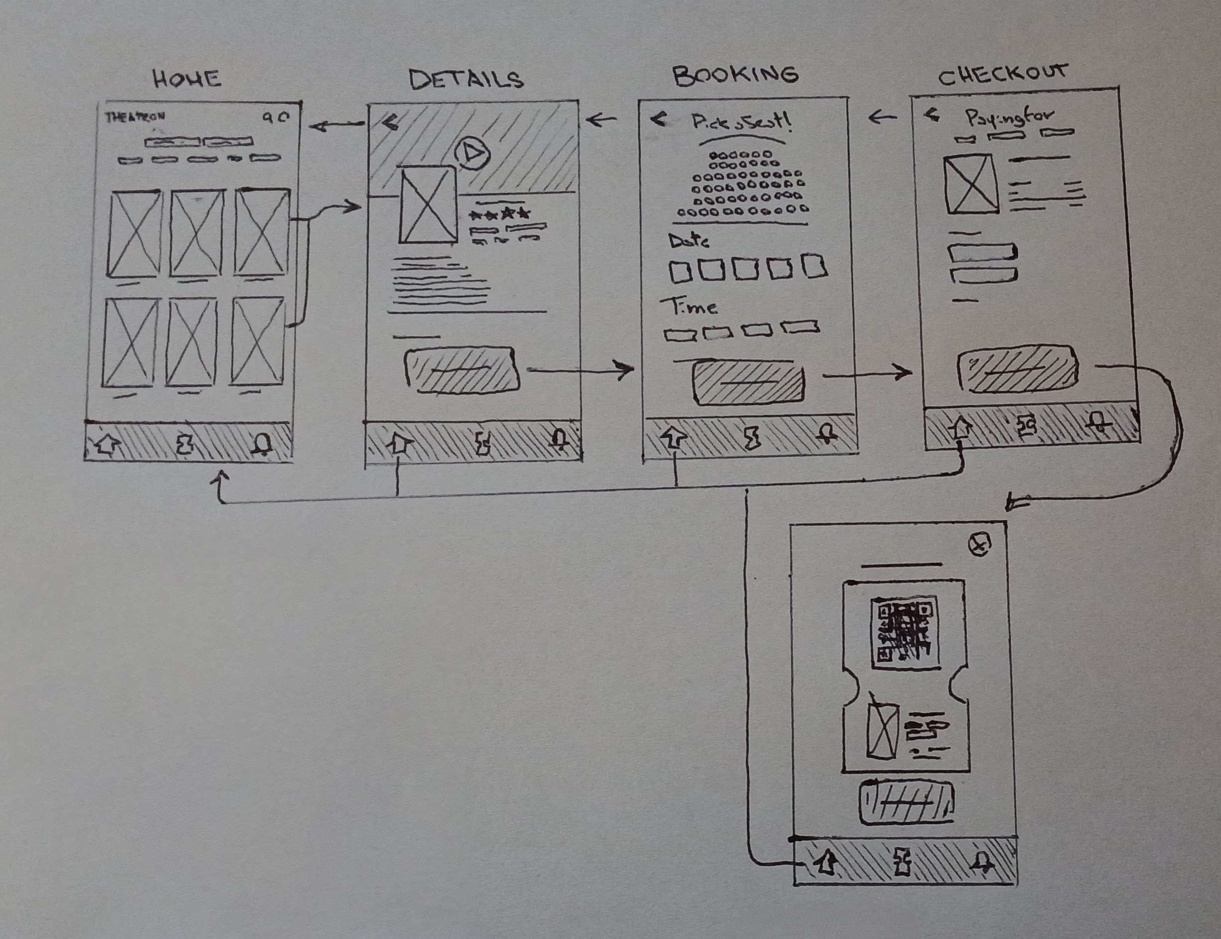
I started the design process by sketching out various ideas for the app's layout and key features. These initial sketches served as a way to quickly explore different concepts and user flows. This is crucial for me, as sometimes the solutions appear only by drawing and moving my hands and pencils, without thinking too much. Then, with those solutions, and with new questions to ask, I iterate with digital tools, refining them as much as needed. I tried Rapid sketching and storyboards on other papers that I can’t seem to find, but I got one of these first versions of the wireframes.
Prototype
I proceeded to create low-fidelity wireframes using Figma to visualize the layout and structure of key screens. These wireframes then evolved into high-fidelity mockups, providing a more polished and realistic representation of the app's interface, but we will see them a bit later on.
Wireframes
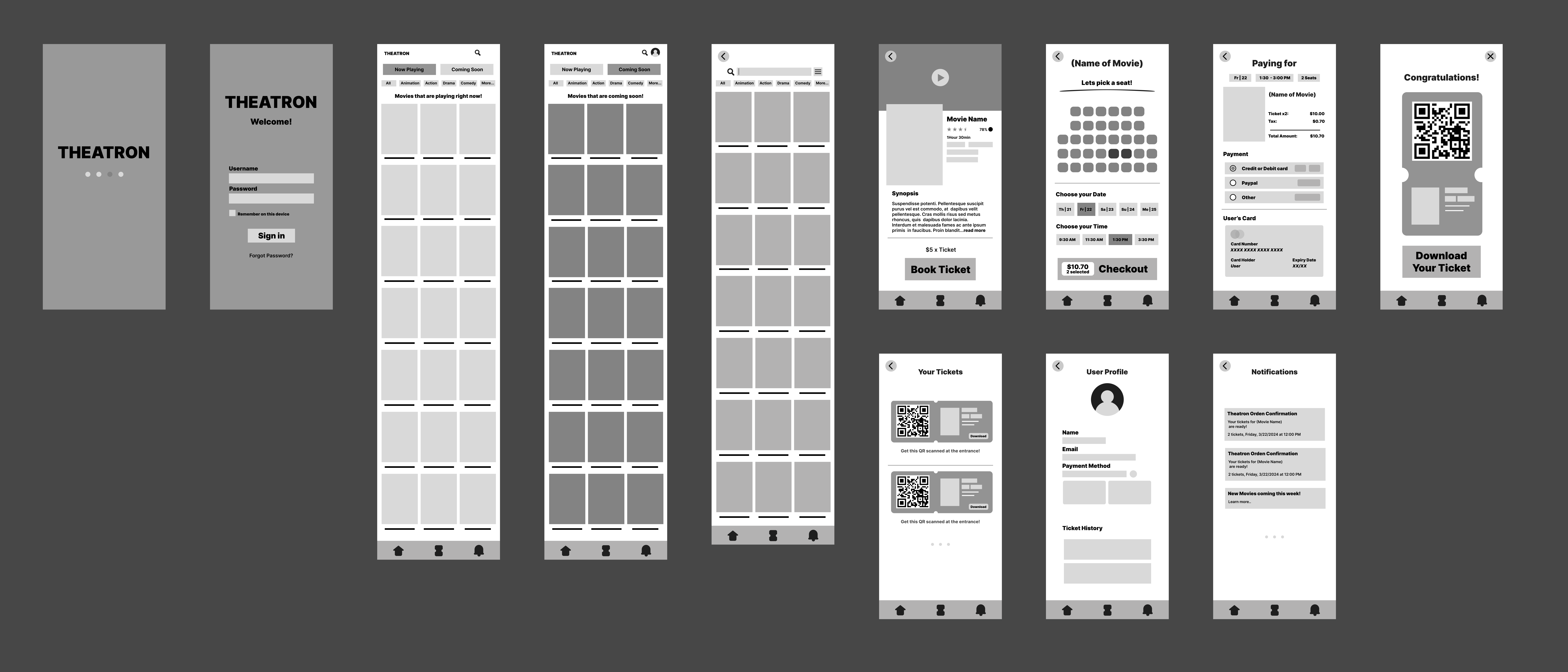
The first iterations of the digital Wireframes (Homepage, Coming soon, Search, Movie Details, Booking, Checkout, Profile, Notifications)
Low Fidelity Prototype
Prototype Details
The interactive, low-fidelity prototype, built using Figma, focuses on core user flows such as browsing movies, purchasing tickets, selecting seats, and managing digital tickets. This prototype allowed me to simulate the user experience and identify potential usability issues early in the design process, and was extremely useful for real user testing. It helped me ensure a streamlined and enjoyable movie ticketing experience.
Even with a fictional project, user feedback is crucial. I conducted usability testing with friends and family, and reaching out online, asking them to perform key tasks within the prototype. This gave me valuable insights into how real users interact with the design and uncover areas that may not have been apparent to me as the designer.
Testing and Iterations
Testing was essential to refine the Theatron app and ensure a user-centered design. I conducted multiple rounds of testing with representative users, gathering feedback to identify pain points and iterate on the design. The fictional nature of the project allowed for flexible, iterative testing with a focus on learning and improvement.
Testing Methods
Moderated Usability Testing
I conducted moderated usability testing sessions with five participants, representative of the target audience (moviegoers aged 20-45). During these sessions, I observed participants interacting with the prototype, asked them to think aloud, and encouraged them to share their thoughts and frustrations. These tests were crucial for understanding users' behavior and pain points.
Cognitive Walkthrough
To further evaluate the app's usability, I performed a Cognitive Walkthrough. I stepped through key user tasks, considering the user's goals, the actions they would take, and the system's responses. This helped me identify potential usability issues from the user's perspective, focusing on learnability and ease of use for new users.
Key Findings & Iterations
Homepage Navigation
Initial Design: The initial homepage design included a prominent "Coming Soon" section, which some users found distracting. They primarily wanted to see movies currently playing.
Iteration: I moved the "Coming Soon" section below "Now Playing" and gave more visual prominence to current releases. This improved the clarity and efficiency of the homepage.
Seat Selection Clarity
Initial Design: Users found the seat map difficult to interpret, particularly regarding screen position and seat availability. The lack of clear labels and numbers caused confusion.
Iteration: Added clear row and seat numbers, improved color-coding for seat availability, and included a visual representation of the screen position to enhance clarity and user confidence during seat selection.
Checkout Streamlining
Initial Design: Some users expressed confusion during checkout, particularly regarding payment confirmation. The process felt unclear, leading to concerns about accidental purchases.
Iteration: Streamlined the checkout process by reducing the number of steps. Added clear visual feedback upon successful payment to provide reassurance and prevent accidental repurchases.
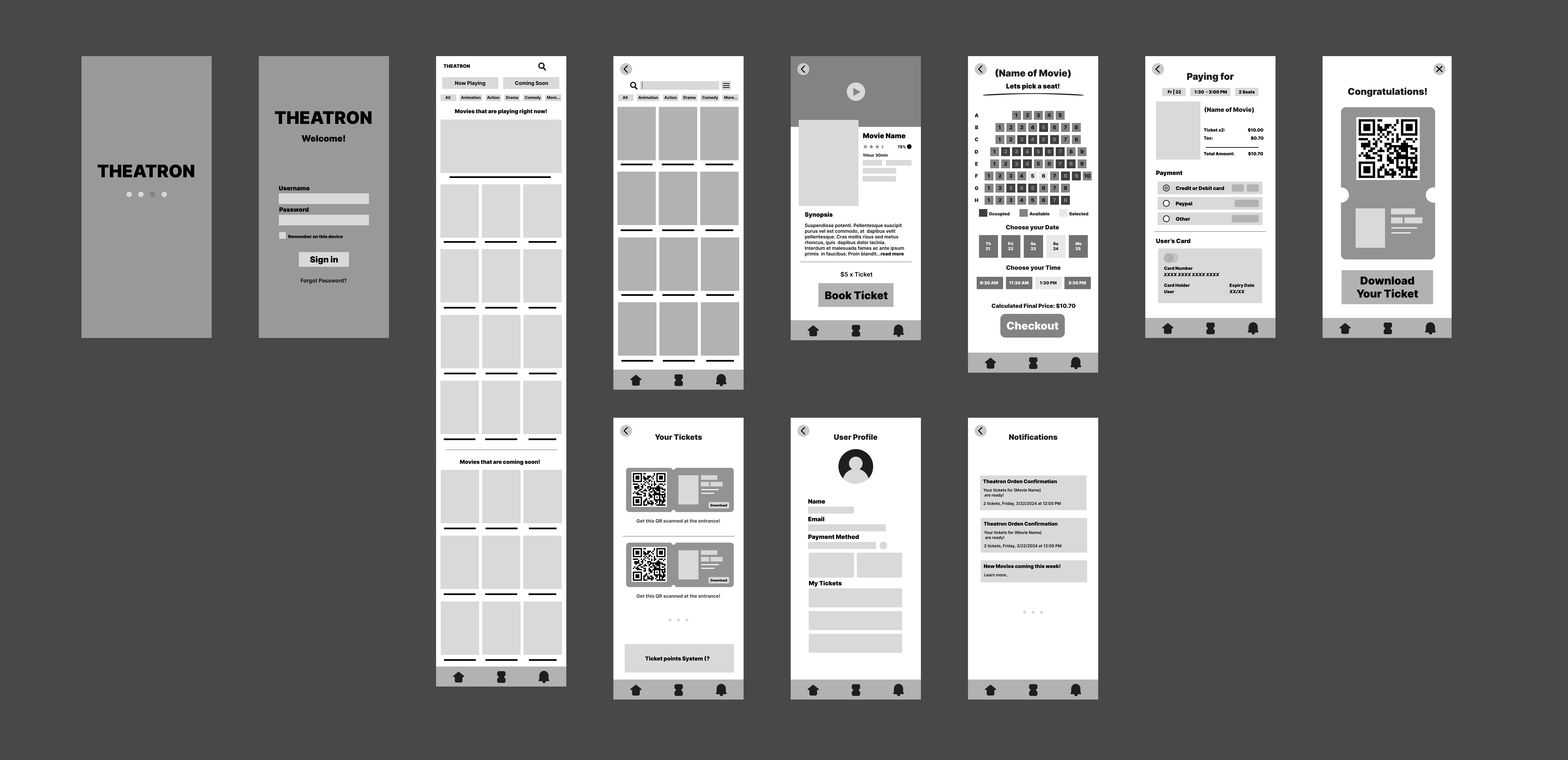
Updated Wireframes after User Testing
User Feedback, After testing once again
“The app is much easier to use now! I love how quickly I can find movies and buy tickets.”
“The seat selection is so much clearer. I feel confident I picked the right seats for my family.”
“I appreciate the simplified checkout. It's much faster and less stressful.”
These iterations, driven by user feedback, enhanced the app’s usability and overall user experience, validating the user-centered design approach. The iterative nature of the project allowed for flexible improvements and helped me train my problem-solving skills.
Final Design
After multiple rounds of testing and iteration, I moved into the Final Design phase. Here, I translated the low-fidelity prototypes into polished, high-fidelity mockups that captured the visual brand and personality of Theatron. The goal was to create a design that was not only functional and user-friendly but also visually appealing and engaging.
High-Fidelity Mockups and Prototype
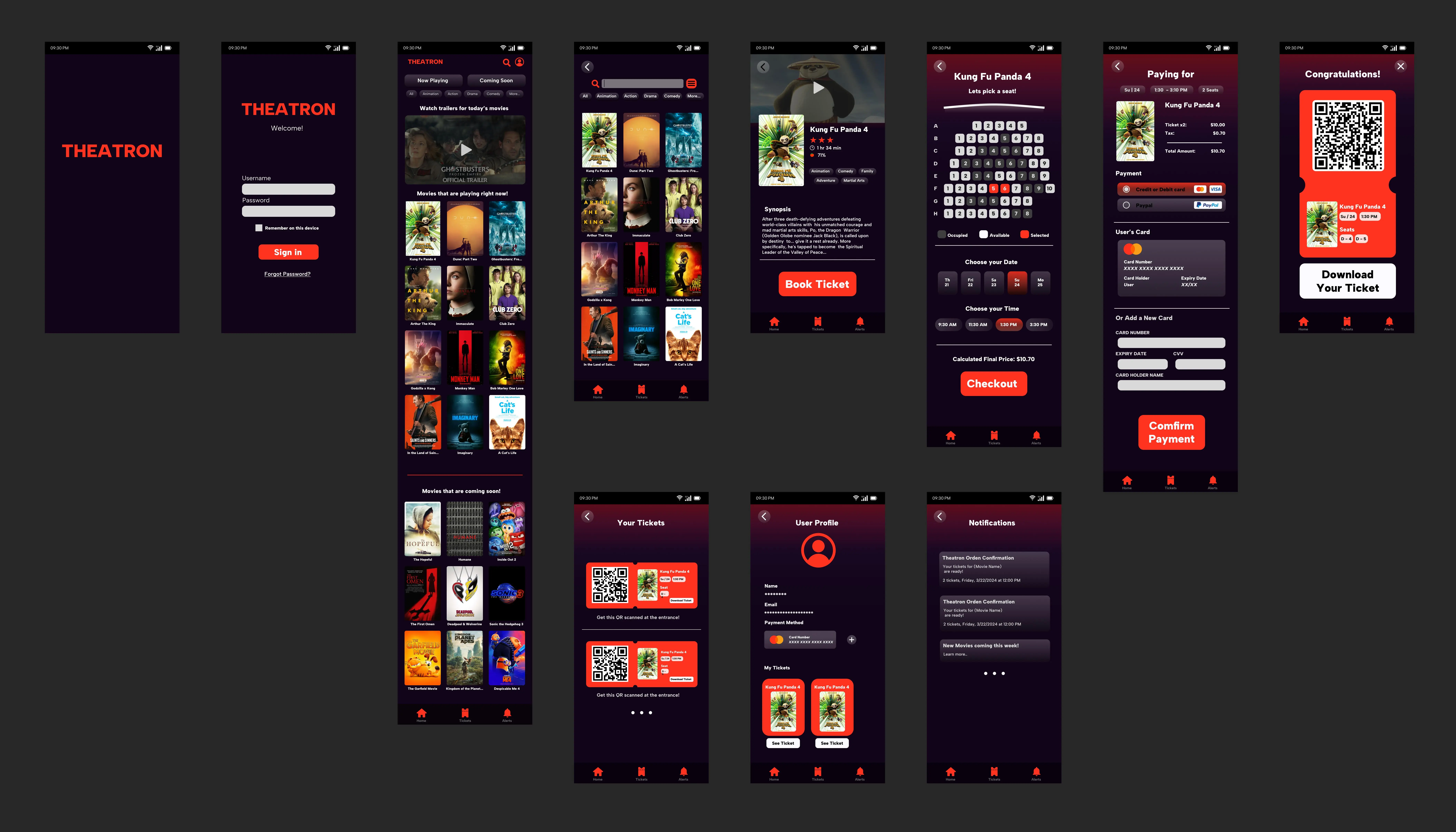
Interactive Prototype
Prototype Details
This high-fidelity prototype demonstrates the final user interface and interactions, incorporating visual design elements and transitions. It provides a realistic simulation of the Theatron app experience.
The prototype allows users to explore the following key functionalities:
- Browse movies (Now Playing, Coming Soon)
- Filter movies by genre and other criteria
- View movie details (synopsis, trailers, showtimes)
- Select seats using an interactive seat map
- Purchase tickets through a streamlined checkout flow
- Access and manage digital tickets
Color Palette
#FF331F (Vivid Red): Primary brand color, used for calls to action, highlights, and important interactive elements.
#EDE9EF (Soft White): Used for text and UI elements to ensure clear readability and contrast against the darker background.
#110418 (Dark Purple): Used as a background color for specific elements, creating depth and visual interest.
Typography
Albert Sans: Used for all text within the app. The clean, modern sans-serif style ensures readability and complements the overall aesthetic. Variations in weight (regular, medium, bold) are used to create a clear visual hierarchy.
Iconography
The icons used in Theatron follow a consistent style, using simple, recognizable forms that are easy to understand. The icons are designed to complement the overall aesthetic of the app and enhance usability.
Imagery
Theatron features high-quality movie posters and promotional imagery to enhance the visual experience. Images are optimized for different screen sizes and resolutions, ensuring a crisp and clear display.
UI Components
Reusable UI components are used throughout the app to create a consistent user experience. Buttons, form elements, and other interactive elements follow a unified design language.
Accessibility
Theatron was designed with accessibility in mind, ensuring the app is inclusive and usable for people with disabilities. Key accessibility features include:
- Sufficient Color Contrast: Ensuring enough contrast between text and background colors for users with low vision.
- Simple Design: The overall design aims to be as simple and clear as possible.
- Text Descriptions: Based on user feedback, I realized that adding text to areas like the bottom navigation would improve clarity.
Conclusion
The Theatron app project represents more than just a design exercise; it was a deep dive into the complete UX/UI design process. From the initial research phase through to the final interactive prototype, each step taught me valuable lessons about creating meaningful user experiences.
Key Takeaways
My journey through this project revealed several crucial insights that have shaped my approach to design.
The power of iteration became crystal clear during testing, watching users interact with early prototypes showed me that what seems obvious to a designer isn’t always clear to users. Each round of feedback led to meaningful improvements, from simplifying the checkout flow to enhancing seat selection clarity. This iterative process taught me to embrace feedback.
Documentation played a bigger role than I initially expected. Writing this case study helped me realize how important it is to articulate design decisions clearly, and this is a skill that’s crucial when working with developers, stakeholders, and other designers. It forced me to think deeply about my choices and their implications.
Perhaps most importantly, it reinforced that great design isn’t just about making things look good. It’s about creating experiences that feel natural and effortless. Every color choice, every interaction, and every piece of feedback had to serve the user’s needs while maintaining visual appeal and accessibility.
Real-World Impact
While Theatron is a concept project, its potential impact on the real world is significant:
For users, it would transform the often frustrating experience of movie ticket booking into something actually enjoyable. The streamlined process, from browsing movies to selecting seats, could save people valuable time and reduce anxiety about seating arrangements.
From a business perspective, the efficiency gains could be substantial. Digital ticketing reduces staff workload at peak times, minimizes paper waste, and creates opportunities for data-driven improvements to the customer experience.
The emphasis on accessibility and intuitive design means more people can enjoy the cinema experience without barriers, whether they’re tech-savvy young professionals like Sarah or busy parents like David.
Future Development
Looking ahead, there are several possibilities for evolution:
- Smart recommendations based on viewing history and preferences
- Integration with theater loyalty programs
- Enhanced accessibility features for diverse user needs
Final Reflections
This project pushed me to think deeply about every aspect of the user experience, from the first tap to the final confirmation. While Theatron may be fictional, the skills I’ve developed and the insights I’ve gained are very real. I’ve learned to balance user needs with business goals, to iterate based on feedback, and to create designs that are functional and attractive.
I'm proud of how this project demonstrates my ability to tackle complex UX challenges and create solutions that make a difference. As I look toward future opportunities, I’m excited to bring my dedication and user-centered thinking to real-world projects.
Thank you for taking the time to explore this case study. I welcome any questions or discussions about my process, decisions, or potential collaborations.